
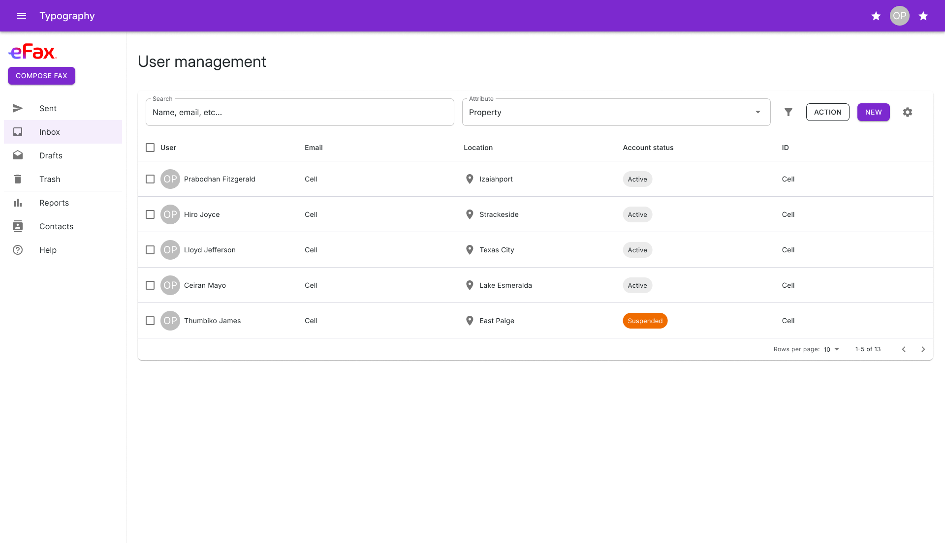
Start from what engineering ships
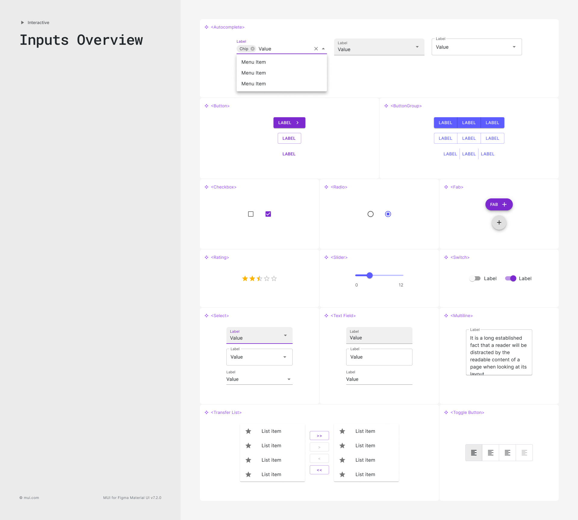
Rebuilding buttons and inputs from scratch was slowing every release. We standardized on MUI, the accessible (WCAG 2.1 AA) React library engineering already used, and made MUI for Figma v7.2.0 the design side of the same system. A component in Figma has the same name and the same props as the one in code.
The library covers 48 component pages across inputs, data display, feedback, surfaces, navigation, and layout, plus MUI X for the data grid, date and time pickers, charts, and tree view.
The brand lives in variables
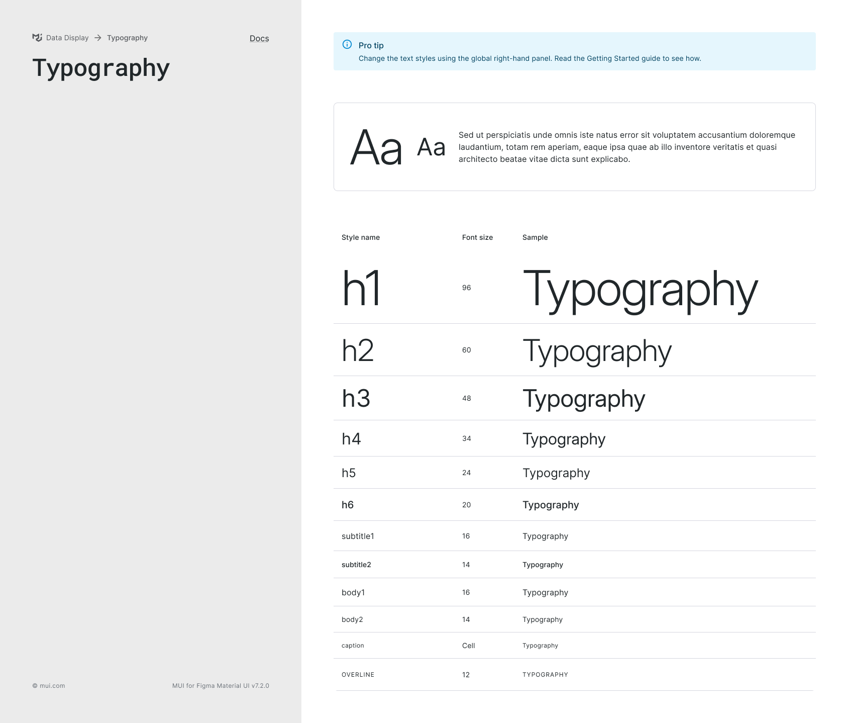
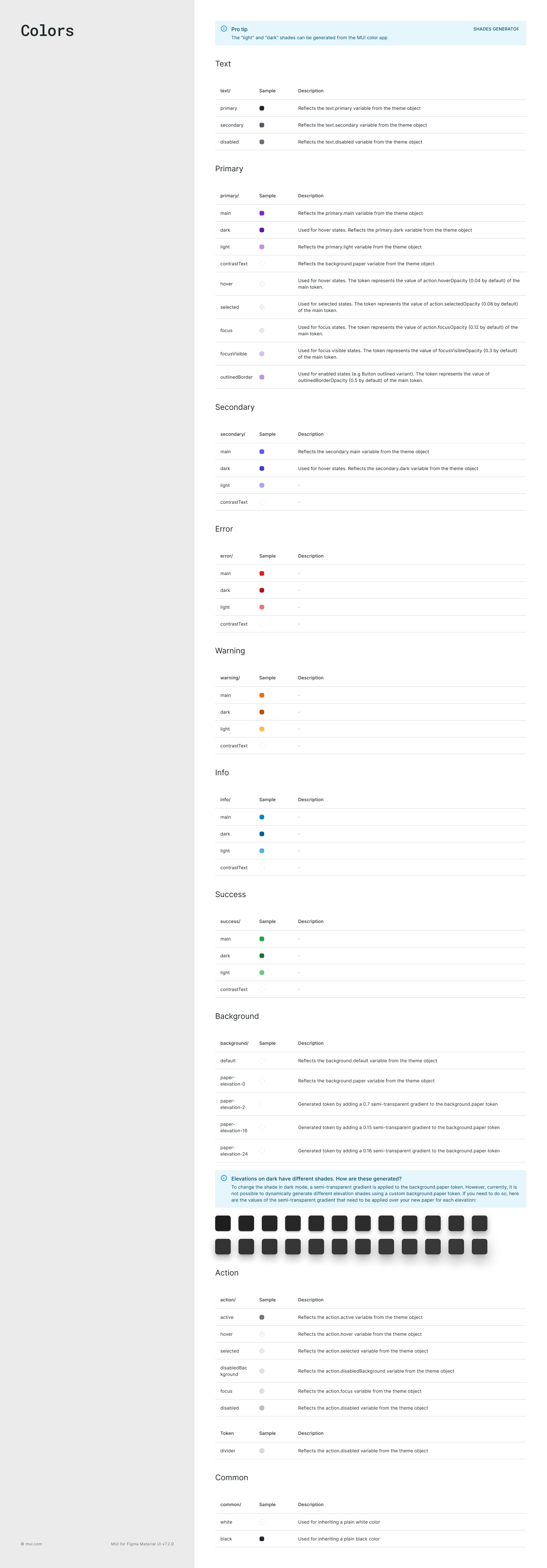
eFax color, type, and spacing are set as Figma variables that mirror MUI’s theme object: primary, secondary, error, warning, info, and success, each with main, light, dark, and state values. Change a token and every component picks it up. Nobody repaints a button by hand.
eFax patterns built from MUI parts
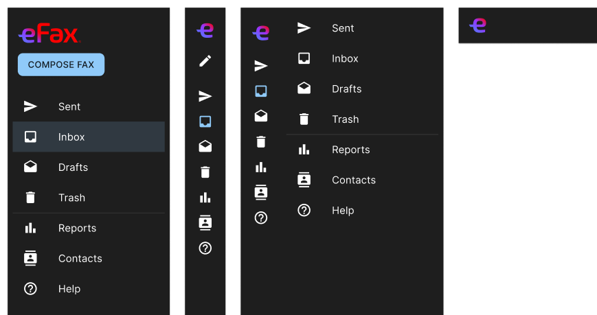
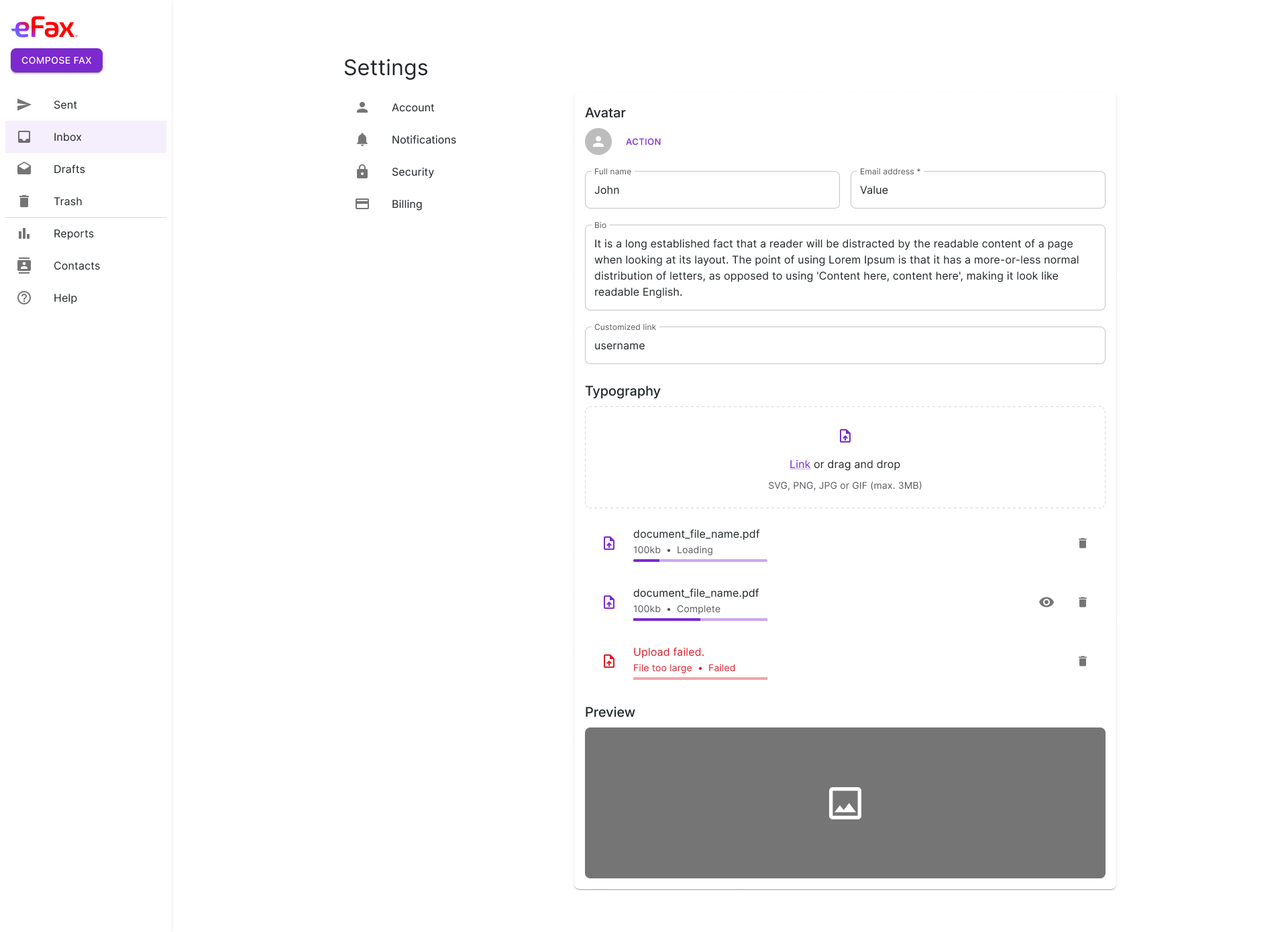
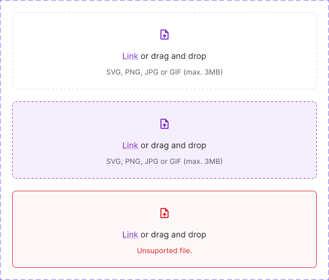
On top of the core set, the library has the patterns eFax screens need: a side nav with default, slim, combined, and mobile variants, nested nav items, page headings, sign-in and passwordless forms, a file uploader with resting, hover, uploading, complete, and failed states, and settings blocks for plans, billing, payment, notifications, and logged-in devices.
Screens that hold up at every size
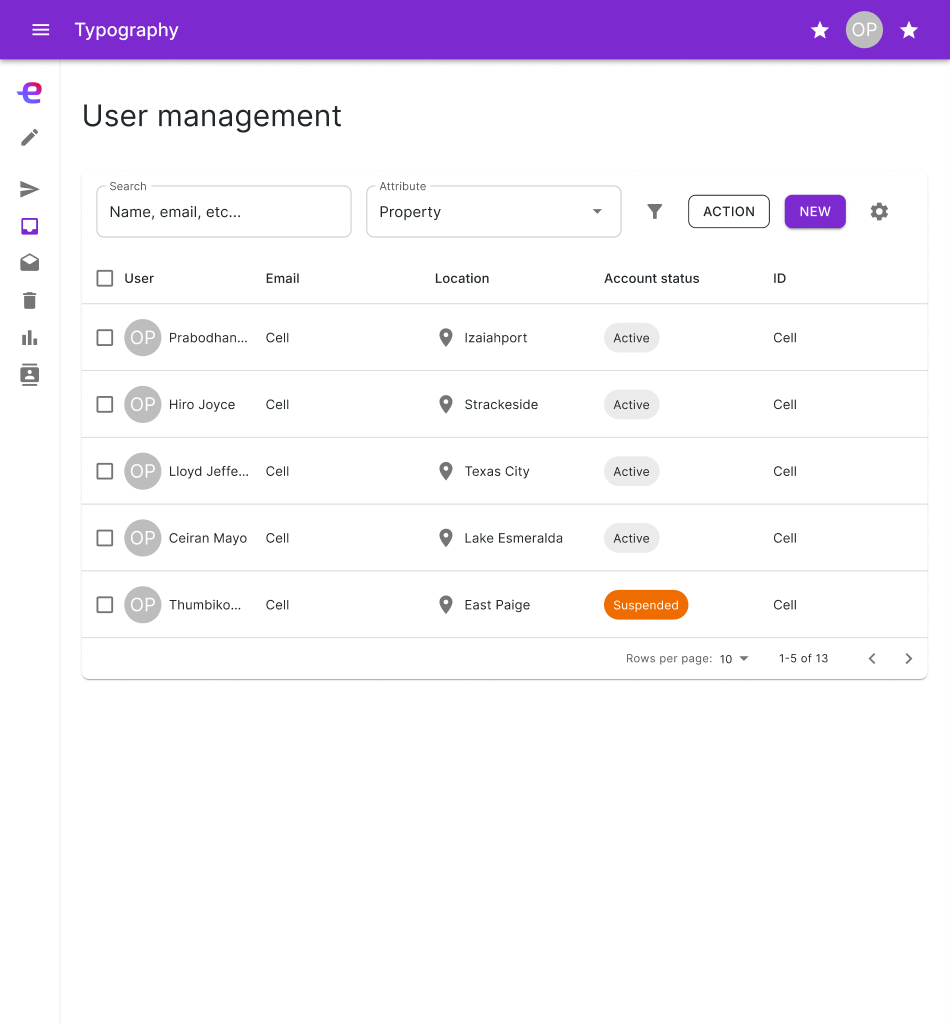
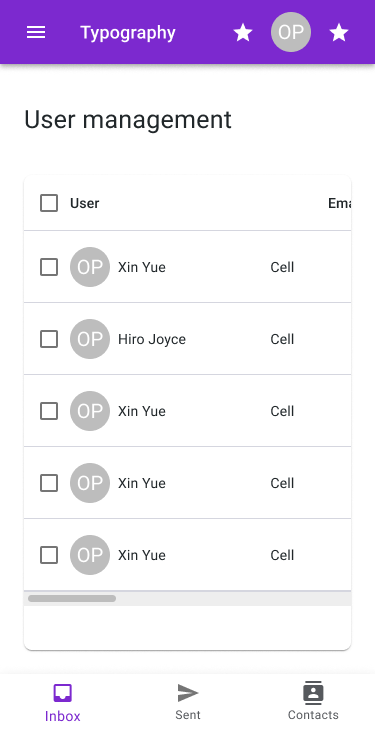
Page templates use the same pieces at five breakpoints, from 2048 pixels wide down to 375. On tablets the side nav goes slim. On phones it becomes bottom navigation.
From Figma to code
I connected the design system to engineering through Figma MCP, so Kiro builds screens from real components instead of mockups. Kiro also keeps token updates in sync between Figma and the codebase, and Storybook documents every component for engineering, so what designers see is what engineers build.
Result
Design and engineering work from one set of components. With the brand variables wired into Figma Make, prototyping went from three days to 30 minutes, and the cycle from brief to stakeholder-ready prototype got 50% faster.