Philips Hue eCommerce site
Fine-tune for the perfect lighting
Scroll ↓
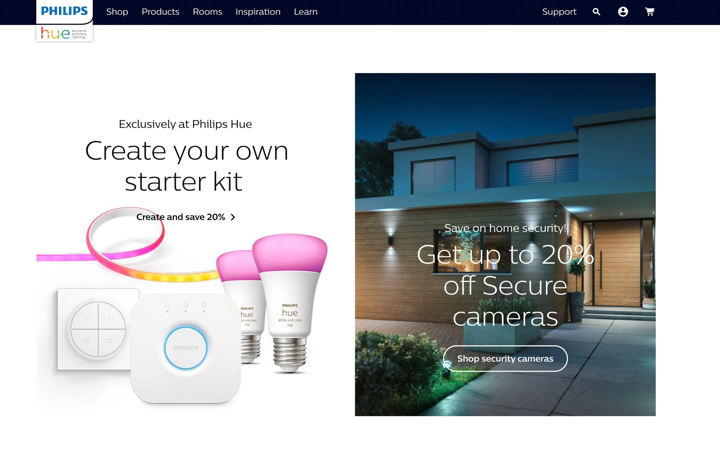
Philips Hue eCommerce site & Lighting App
Challenge: led creative direction and UX on the Philips Hue website and the mobile app. Two products, one ecosystem, and they had to work as a pair. On the web, the job was helping people choose the right hardware in a category that overwhelms most shoppers. In the app, the job was getting those products connected and working once they got home. Bridge or Bluetooth, bulbs, fixtures, scenes, starter kits. Most people are not looking for a spec sheet. They want a room to feel a certain way and need clear guidance from browsing through setup. That is what we built across the site and the app.
(Role: Creative direction, UX/UI)
https://www.philips-hue.com/en-us
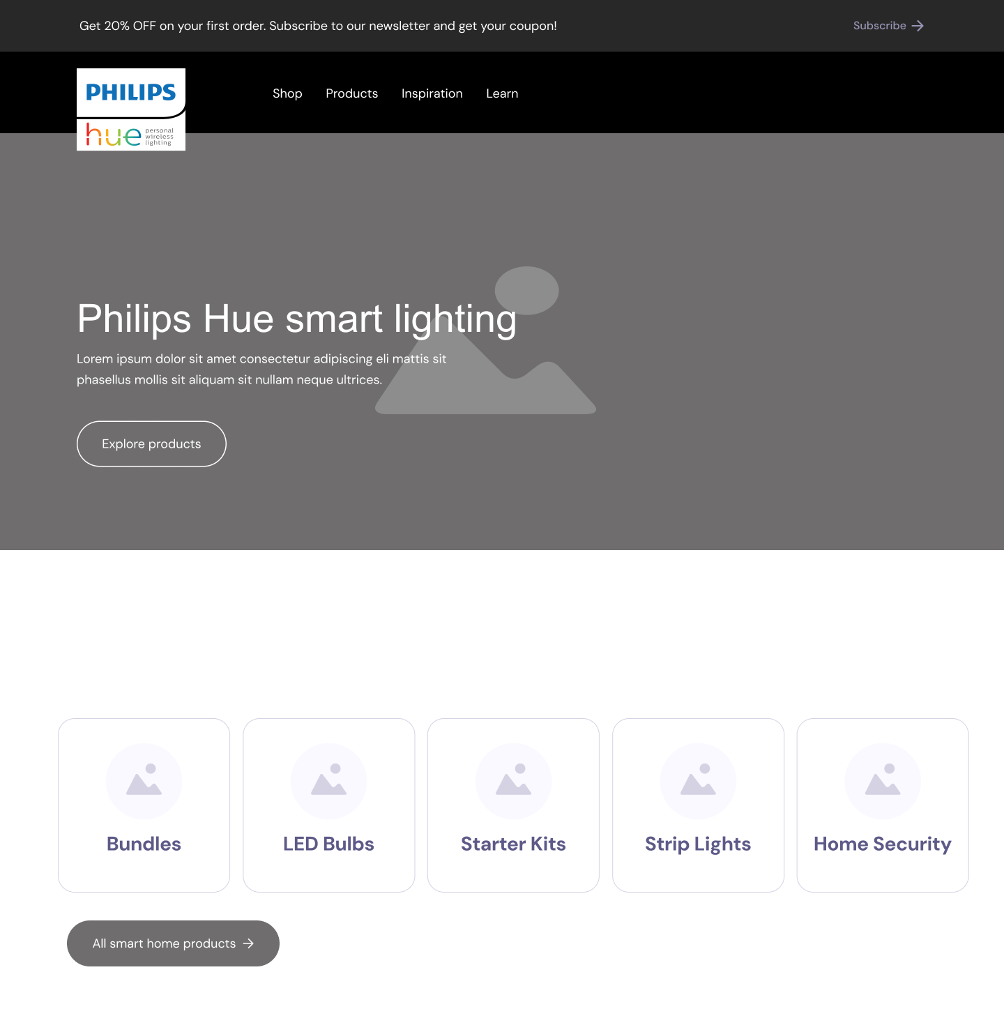
Enhancing Key User Journeys:
Three journeys mattered most: finding the right products on the site, getting through checkout without second guessing, and getting everything connected in the app once it arrived. I worked with the team on the site flows and the app onboarding so those steps felt connected, not like two different products. Copy was part of it too. Setup guides and product descriptions had to do real work, not just sound on brand, so I partnered with copywriters to make sure people had what they needed at each step.


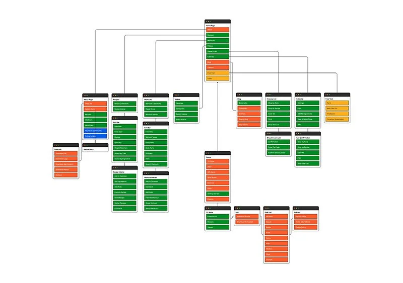
Crafting Wireframes and a Clear Sitemap:
Hue's catalog had outgrown its structure, so we rebuilt the sitemap first. First time buyers, people adding to a system they already had, the Bridge question, room by room browsing. All of that needed a home before we wireframed anything. I worked with the UX team on the site and app flows so navigation, product pages, and checkout told people what to buy and what they would need next without assuming they already knew the ecosystem.
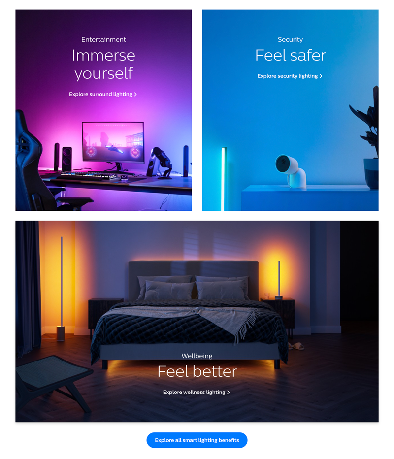
Creative Direction & Visual Cohesion:
Hue has a strong brand and the job was keeping the website and app feeling like the same company. I provided creative direction on the visual side, working in Photoshop and with the design team, so layouts, imagery, and UI patterns held together from the store through the app. Nothing fancy. Just consistency, so the experience felt intentional whether you were shopping or setting up your first light.
Outcomes
People could browse, buy, and set up without hitting walls that used to come from the site and app feeling disconnected. The structure gave first time buyers a clearer path through the catalog, and the app onboarding picked up where the site left off. The client rolled the work into production across the web experience and the lighting app.

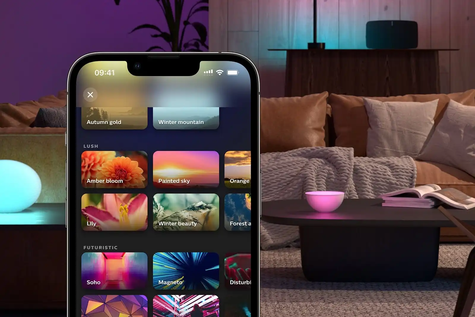
Leading a Collaborative Design Effort:
As Creative Director of UX, I led the team across the website and the app. We started with competitive research and stakeholder sessions to agree on where Hue was falling short and what good would look like for new customers versus people expanding their system. I ran workshops with UX and visual designers to turn that into actual page flows and app screens, and stayed close to copywriters so the product education on the site matched what people needed during setup in the app. My role was keeping everyone aligned on the same problem, not just signing off on comps at the end