Verizon
Verizon Payments
Scroll ↓
Verizon Split Payment Experience & App
Challenge: Redesign Verizon’s payment flow to give users flexibility and confidence in splitting transactions, reducing friction, and increasing completion rates.
Role:Director of UX & Design
Split Payment Details Screen
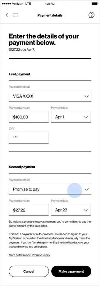
This screen lets users break a single Verizon bill into two separate payments. The first section captures the primary payment method, amount, and date, while the second section allows users to schedule a secondary payment using a “Promise to Pay.” The layout emphasizes clarity: each payment has its own input fields, labels, and deadlines.
Instructions below the second payment ensure users understand that this isn’t an automatic payment—they must manually complete it by the date specified. Clear messaging reduces confusion, sets expectations, and builds trust while giving users flexibility to manage their bills.
Key UX considerations:
Simple, linear flow for entering multiple payments.
Prominent due dates for each payment to prevent missed deadlines.
Explicit explanation of “Promise to Pay” to avoid assumptions about auto-pay.
Minimal visual clutter to keep focus on completing the task efficiently.
Split Payment Flow Analysis
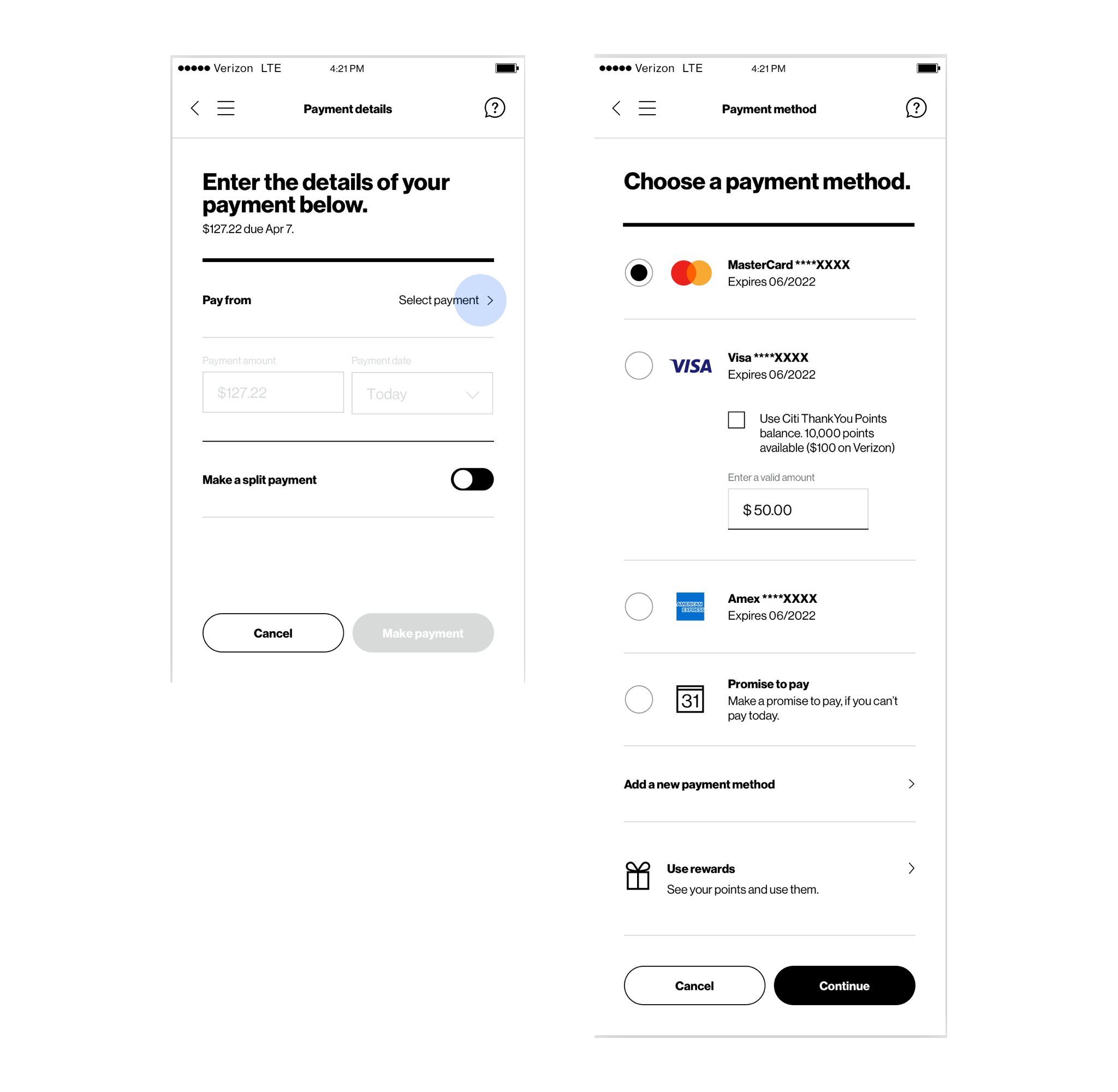
The interface utilizes a contextual toggle system to transform a standard payment into a split transaction. Once the "Make a split payment" toggle is engaged, the user is transitioned into the secondary "Choose a payment method" view, where the system tracks the remaining balance in real-time. This ensures that the user can strategically allocate specific amounts (e.g., $50.00) to different cards or rewards programs while maintaining a clear view of their total obligation.
Unified UX Considerations
Dual-Path Flexibility: The design accommodates both immediate full payments and partial payments via the "Promise to pay" feature, reducing churn for users facing temporary liquidity issues.
Integrated Rewards Logic: By embedding the "Citi ThankYou Points" option directly within the Visa card selection, the UX minimizes cognitive load, allowing users to apply points and cash in a single, streamlined interaction.
Visual Consistency: Both screens utilize a clean, high-contrast aesthetic with identical header navigation, ensuring the user feels they are within a single secure environment throughout the sensitive checkout process.
Validation and Error Prevention: The "Make payment" and "Continue" buttons use state-based styling (grey vs. black) to provide immediate feedback on whether the user has fulfilled the necessary input requirements for each step.